Power BI Custom Visuals
Welcome to a world where your data visualization needs are met with precision and creativity. At DataViz Artisan, I specialize in crafting custom Power BI visuals tailored uniquely for you. Whether you’re navigating complex data challenges or require visuals that align precisely with your industry requirements, my service is dedicated to providing solutions that bring clarity and impact to your data. Each visual is more than just a chart or graph; it’s a custom-made tool designed to illuminate your data’s true story. If you’re in search of a visual that fits seamlessly with your specific data narrative, you’ve come to the right place. Let’s transform your data into a visual masterpiece that speaks volumes together.
Free Charts at App Source
Dive into the world of data visualization with our selection of free visuals available on Microsoft AppSource.These visuals are a testament to our commitment to quality, innovation, and user-friendly design. Ideal for those looking to enhance their Power BI reports, our visuals offer a glimpse into the possibilities of custom visualization. They are not only powerful tools for data analysis but also easy to integrate and use. Explore these free offerings to experience the impact of well-designed visuals on your data storytelling. Give them a try in your next project and see the difference they can make in bringing your data to life
Dot Chart
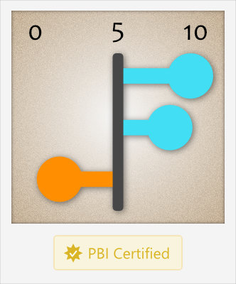
The Dot Chart, the horizontal lollipop chart, is a versatile and intuitive data visualization tool designed to present your data clearly and engagingly. It utilizes simple dots to represent data points linked by lines that guide the eye, making patterns, trends, and outliers instantly recognizable. This visual is particularly effective when comparing values across categories, making it a valuable asset in diverse fields, including business intelligence, research, and more. Whether you want to represent statistical distributions, frequencies, or comparative data, the Dot Chart offers a clean, minimalist approach to illuminate your insights.
Change Chart
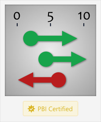
The Change Chart, a variant of the classic dumbbell chart, offers a clear and impactful way to visualize data fluctuations across various categories. It employs horizontal arrows to represent changes in your data, making it particularly effective for tracking growth, decline, or stability over time. Each arrow’s length is proportional to the magnitude of change, offering an immediate visual cue of data dynamics. This visual is invaluable in business analytics and financial reporting, where understanding data trends and evolutions is crucial. It simplifies complex data sets into an easily digestible format, facilitating quick comprehension and decision-making. Whether you’re presenting comparative performance metrics, financial growth over periods, or any other temporal data, the Change Chart provides a straightforward yet powerful tool to articulate your data story.

